
Client
Client
Suntory Global Spirits
Medium
Packaging
Visual Identity System
Category
Spirits
Old Grand-Dad 7 Year
Old Grand-Dad 7 Year
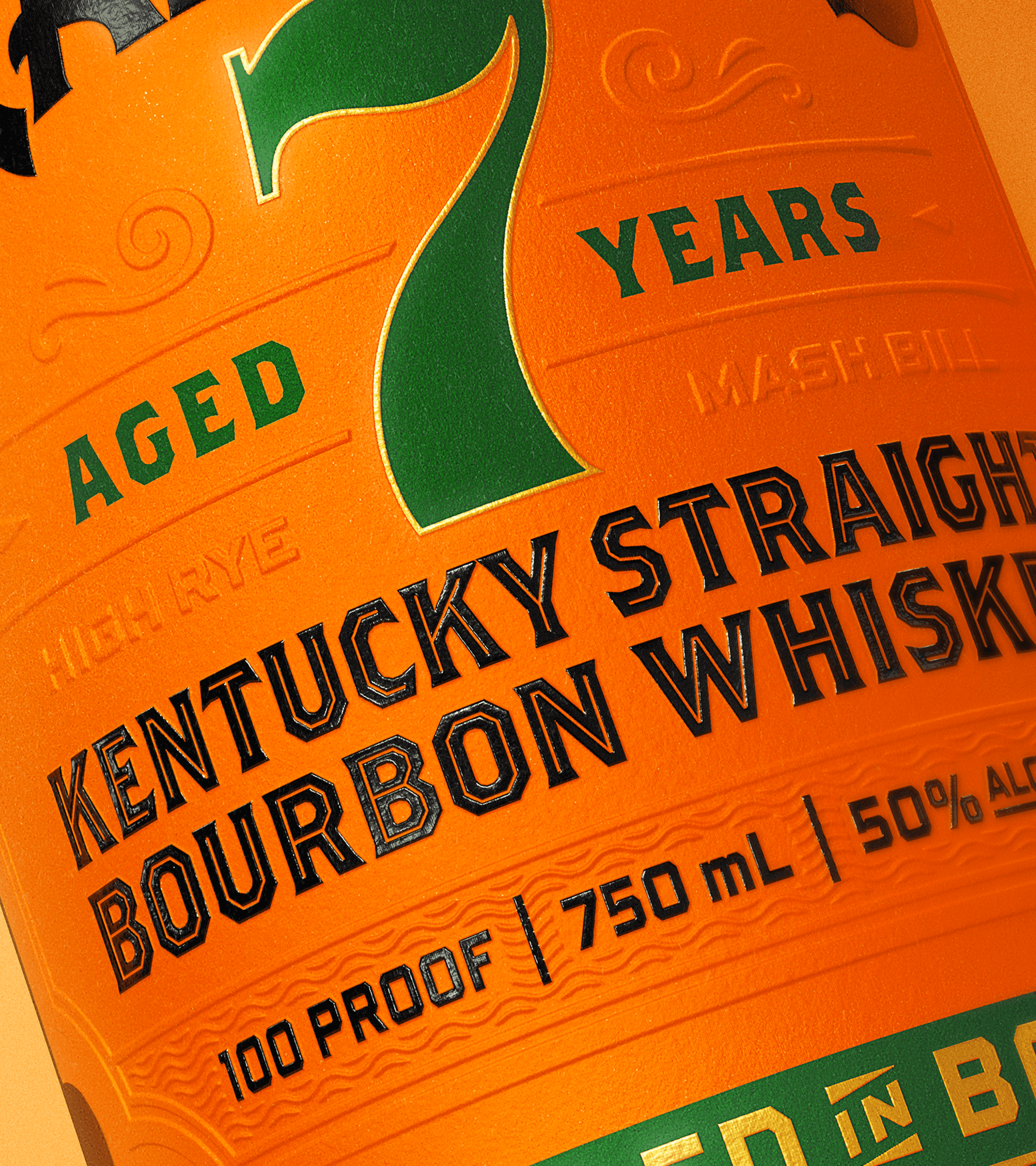
7 Year Bottled in Bond
7 Year Bottled in Bond
Old Grand-Dad is one of bourbon’s most enduring names, but endurance alone isn’t enough. As the portfolio evolved following the successful introduction of Old Grand-Dad 16 Year, the brand faced a quiet but critical challenge: how to bring its most important volume drivers into alignment with a newly established visual language without disrupting the equity that made them iconic in the first place.
Old Grand-Dad 7 Year Bottled in Bond is not a niche release. It is a cornerstone. A workhorse with credibility. The opportunity wasn’t to reinvent it, but to ensure it belonged unmistakably to the same family as the rest of the lineup while respecting the gravity of the Bottled in Bond category.
The success of Old Grand-Dad 16 created permission. Not to modernize aggressively, but to unify deliberately. While 16 may be the most premium expression in the portfolio, it is not the most relevant in terms of volume or focus. The real heartbeat of the brand lives in Old Grand-Dad Core, 7 Year Bottled in Bond, and 114.
For 7 Year BiB, the insight was simple: alignment is power. If Old Grand-Dad was going to feel intentional as a portfolio, its most visible expression needed to carry the same design DNA without losing the trust it had earned over decades.
The goal was not to chase relevance. It was to affirm it.
Tavern approached Old Grand-Dad 7 Year Bottled in Bond as a careful act of brand excavation and refinement. The liquid remained untouched. The story was already there. Our role was to clarify it visually and structurally.
We retained the brand’s core memory structure while elevating its execution. Every decision was made with restraint. Lines were tightened. Hierarchy was clarified. Details were refined. Nothing was added that didn’t earn its place.
This was Modern Heritage in its purest form. Respecting the category rather than redesigning it to death. Honoring the authority of Bottled in Bond while allowing the brand to feel contemporary, confident, and considered.
The work was less about transformation and more about stewardship.
The updated packaging brings Old Grand-Dad 7 Year Bottled in Bond into the newly established Old Grand-Dad visual system without asking it to perform like something it’s not.
Typography, layout, and label architecture were refined to create consistency across the lineup, while preserving the familiar cues that longtime drinkers trust. The result is a bottle that feels immediately recognizable, yet unmistakably part of a modernized portfolio.
This wasn’t a redesign meant to announce itself. It was a cleanup done with intention. A quiet elevation that signals confidence rather than novelty.
Old Grand-Dad 7 Year Bottled in Bond now stands clearly within the Old Grand-Dad family. It looks like it belongs. It reads as intentional. It carries the authority of the Bottled in Bond designation without visual noise or unnecessary embellishment.
More importantly, it reinforces the brand’s long game. By aligning its most important expressions under a cohesive system, Old Grand-Dad strengthened its portfolio equity while preserving the trust it has built over generations.
Sometimes the most modern move is knowing what not to change.


"Tavern has been a phenomenal partner, delivering standout creative and smart strategy with beautiful design. They show up as real partners, not vendors—elevating both the work and the process."
Bradford Lawrence
Global Associate Brand Manager at Suntory Global Spirits


Offices
New York & London
Follow Us
Modern Heritage™ Framework
All rights reserved
Inquiries & Careers
Newsletter
Modern Heritage™ Framework
All rights reserved