
Client
Client
Tavern Brand Incubator
Medium
Packaging
Visual Identity System
Category
Canned Cocktails
Hyper Blast
Hyper Blast
Ride the Wake, Chase the Buzz
Ride the Wake, Chase the Buzz
The ready-to-drink category had become a sea of sameness.
As the category exploded, most brands converged around the same visual language: minimalist white cans, flavor-first systems, stripped-back branding, and interchangeable positioning. Innovation became incremental. New flavors. New functional claims. New celebrity partnerships. But very little that actually felt culturally distinct.
At the same time, an entirely new white space was emerging. Energy drinks had become one of the most emotionally charged categories in modern consumer culture, building worlds, tribes, and identities far beyond the liquid itself. Alcohol had not.
Tavern saw an opportunity to create something entirely different: a high-energy alcoholic brand built with the depth, mythology, and worldbuilding typically reserved for gaming, motorsports, streetwear, and energy culture.
More than just an RTD, a full universe people wanted to step into.
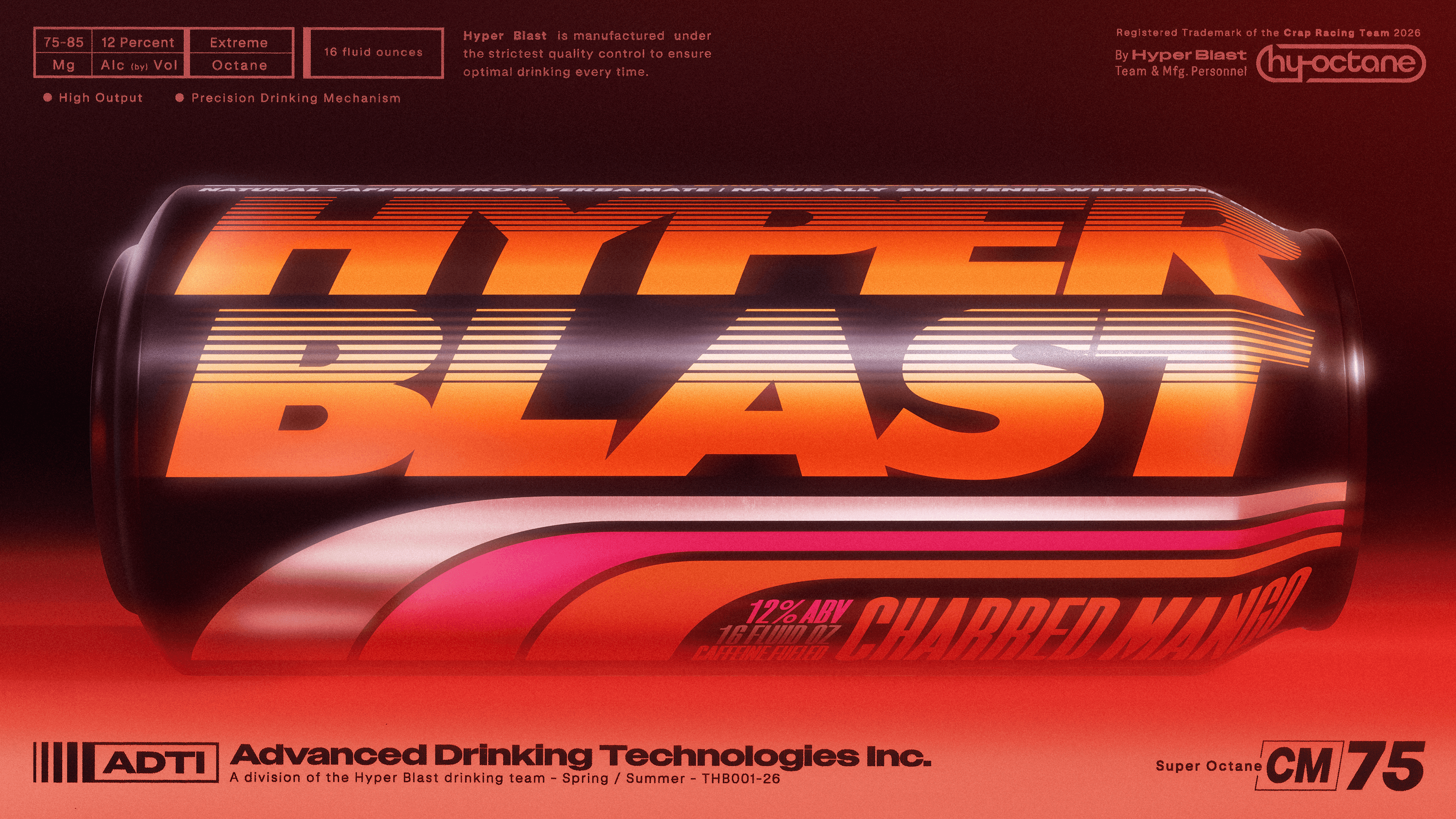
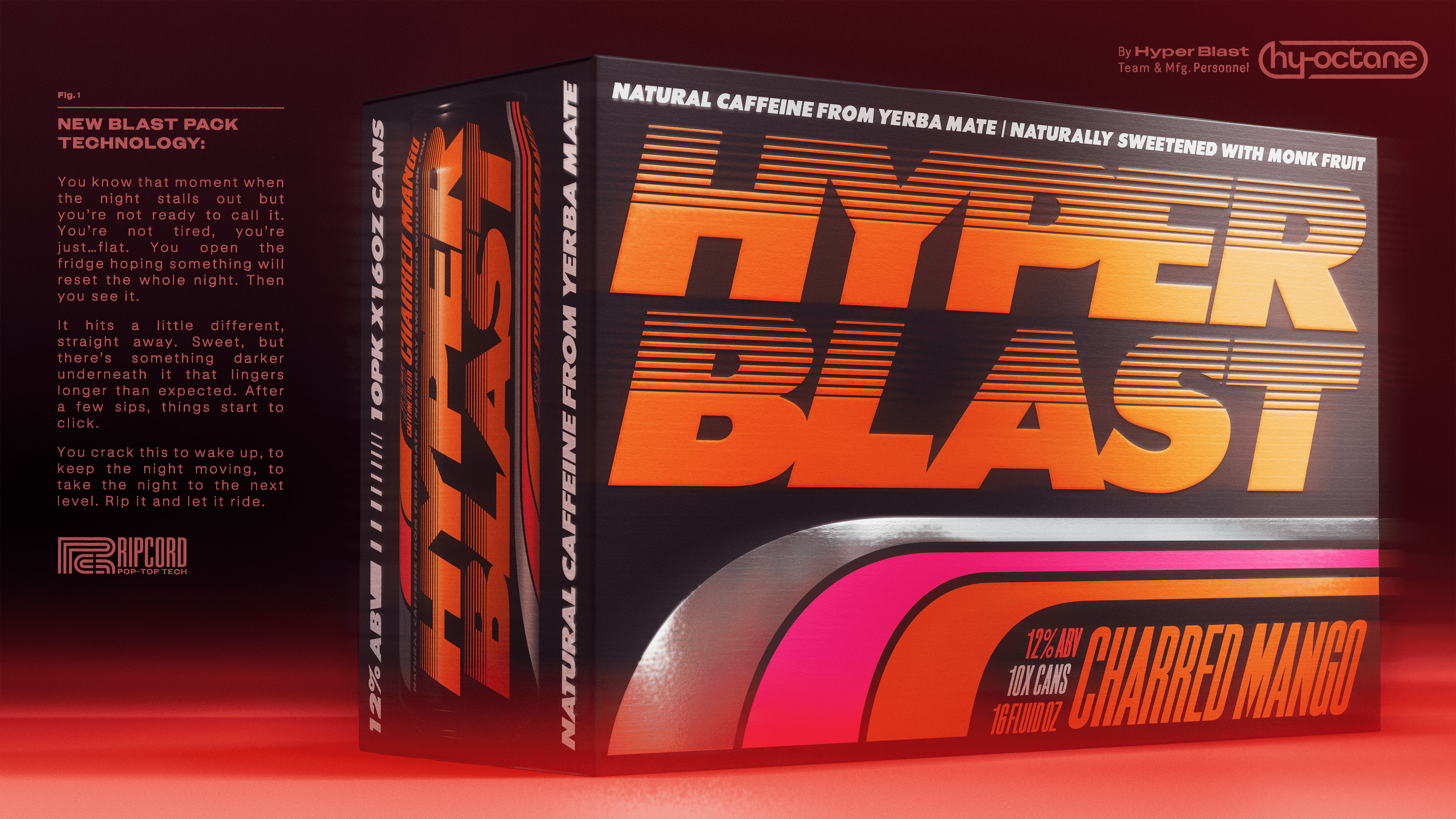
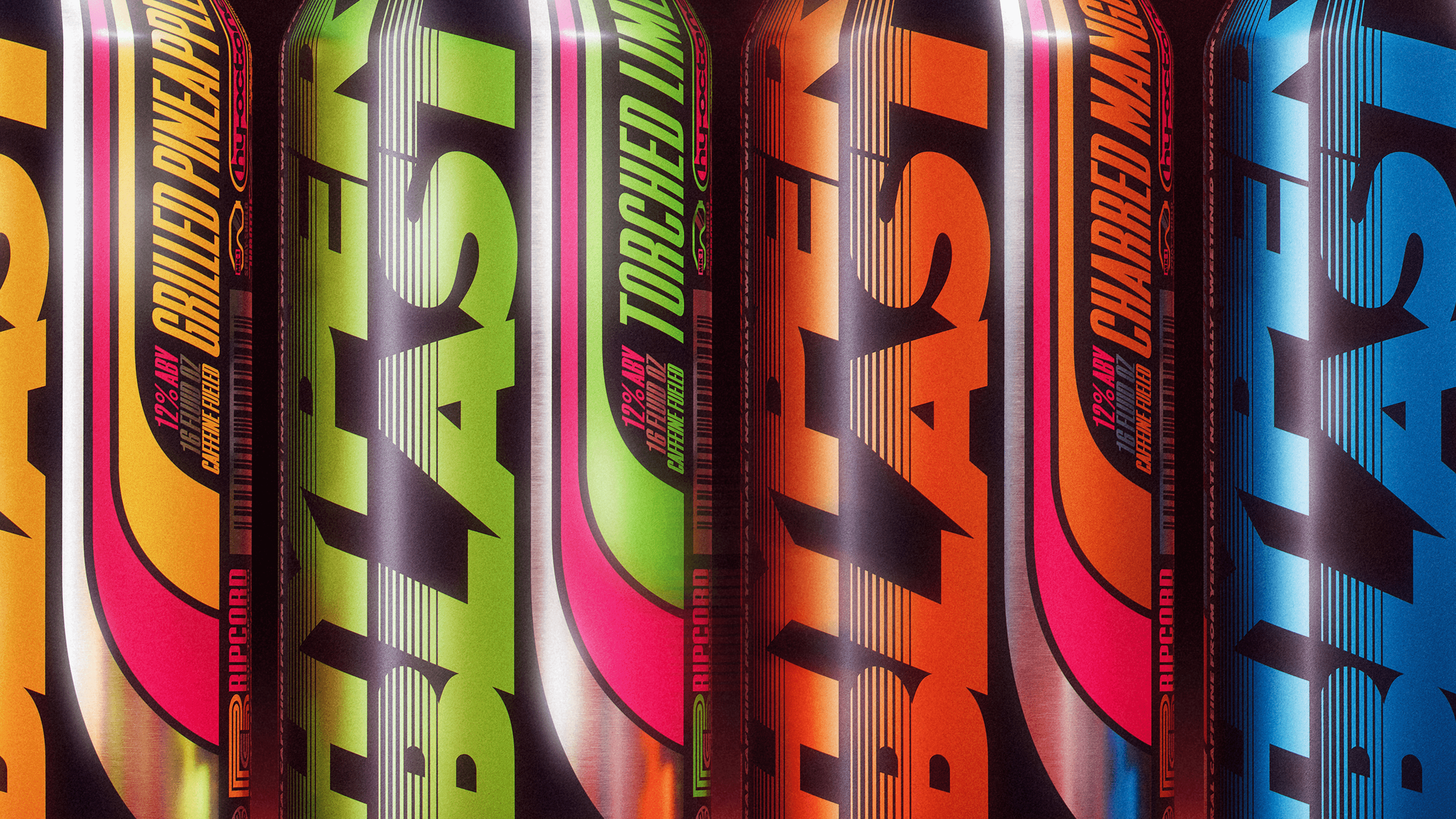
Hyper Blast a 16oz, naturally caffeinated with Yerba Mate, vodka-based alcoholic energy drink built around speed, chaos, adrenaline, and culture. Available in four flame-kissed flavors — Charred Mango, Blackened Razz, Grilled Pineapple, and Torched Lime — Hyper Blast was designed to feel instantly familiar while still delivering something entirely new.
From the beginning, Tavern approached Hyper Blast as far more than a packaging project. The ambition was to build a true brand ecosystem from the ground up, proving Tavern’s ability to create, launch, and operationalize a new-to-world brand end-to-end.
Tavern developed the brand strategy, positioning, naming, identity system, packaging architecture, worldbuilding, campaign system, investor materials, distributor positioning, go-to-market strategy, merchandise ecosystem, and launch communications. The team also worked directly with liquid development partner JAI Development to shape the product itself, refining flavor profiles, liquid credentials, and the overall drinking experience to ensure the final product matched the intensity of the brand world surrounding it.
Drawing heavily from 80s and 90s jet ski culture, analog racing graphics, skate magazines, motorsports decals, and mail-order catalogs, Hyper Blast embraced a visual philosophy Tavern described internally as “controlled chaos.” Instead of the clean, over-simplified design language dominating modern CPG, the brand leaned aggressively into density, layering, texture, and visual overload.
Typography stacked on typography. Sponsor badges collided into performance marks. Motion cues were baked directly into the layouts. Packaging behaved more like editorial design than traditional beverage branding. The cans felt less like products and more like artifacts pulled directly from an existing world.
But the real ambition extended beyond the packaging itself.
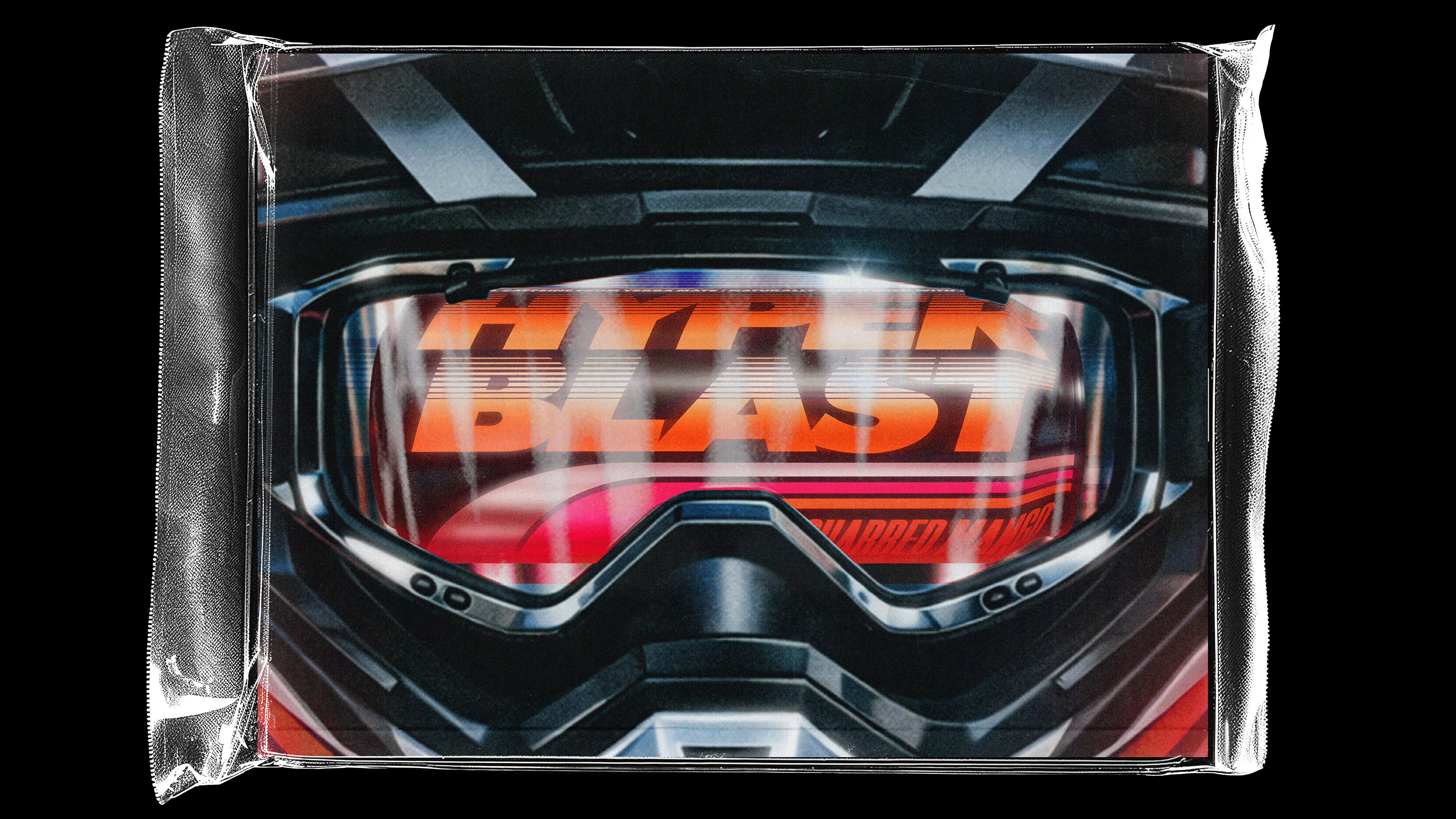
Tavern built an expansive ecosystem around the brand designed to make Hyper Blast feel tangible long before consumers ever took a sip. Fictional racing teams were developed complete with names, insignias, and visual codes. A network of in-world sub-brands spanned helmets, gloves, goggles, and performance equipment including Wave Skull™, a Hyper Blast-branded helmet line integrated directly into the packaging and campaign system. Oversized collage-style jet ski decal sheets transformed merchandise into functional artifacts from within the universe itself rather than traditional branded swag.
Campaign photography, out-of-home, and advertising systems were art directed more like vintage motorsports editorials than alcohol advertising. The goal was immersion over communication. Discovery over explanation.
Tavern intentionally designed the brand to reveal itself slowly over time, rewarding deeper engagement rather than relying solely on shelf impact. The team believed consumers no longer want to simply purchase products. They want to participate in worlds.
That philosophy became foundational to every aspect of the build.
Beyond the creative work, Tavern also led the less visible but equally critical systems required to bring Hyper Blast into the real world. Distributor outreach, retail positioning, investor materials, operational coordination, product refinement, and launch planning were all developed in parallel with the brand itself. The project became a demonstration of Tavern’s belief that the strongest modern brands are not simply designed beautifully. They are operationalized holistically.
Hyper Blast ultimately became a proof point for a larger shift Tavern sees happening across consumer culture.
As categories become increasingly flattened by optimization, speed, and algorithmic sameness, the brands that win are no longer the ones with the simplest packaging system or the cleanest social feed. They are the brands capable of creating emotional gravity. Brands with enough depth, texture, mythology, and specificity that people genuinely want to spend time inside them.
Hyper Blast was built to do exactly that.
Not just to launch another drink into an already crowded category, but to challenge what a modern beverage brand can feel like when worldbuilding, culture, product, and business strategy are developed as one cohesive system from day one.
Strap in. Let’s blast.


Offices
New York & London
Follow Us
Modern Heritage™ Framework
All rights reserved
Inquiries & Careers
Newsletter
Modern Heritage™ Framework
All rights reserved